ADUE reveals its new visual identity, aligning the brand with the company’s growth.
A renewed image, starting with the company logo, to make it more current and dynamic: a transformation that starts from the very heart of the company and its vision of the future.
With the aim of communicating the values of solidity, reliability, speed, recognisability and constant evolution.
The logo, thanks to the elimination of superfluous elements, appears more modern and minimal, in line with the company’s attitude towards change and innovation, but in the spirit of “INNOVATION BY TRADITION”.
In fact, the new logo retains the distinctive element of the “A” with diagonal stripes, representing continuity and recognisability of the brand.
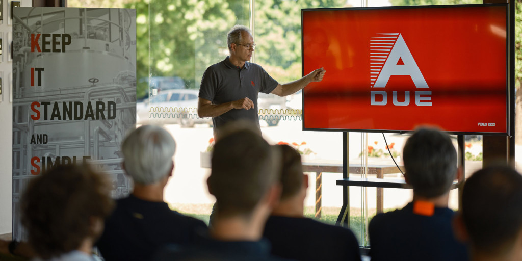
A change that is not only aesthetic but also substantial, thanks to the new KISS (Keep It Simple & Standard) work philosophy that will involve the entire company and which is based on 2 pillars:
1) SIMPLICITY AND STANDARDISATION – to optimise business processes and customer experience.
2) COMMITMENT TO LISTENING – to understand needs and objectives and thus propose the right solution. The simplest possible: “WE MAKE IT EASY”.
The new image was revealed on 29th May during the GOLF EXPERIENCE event.
The day began with General Manager Simone Squeri, who unveiled the new sign made of three-dimensional letters in mirror-polished steel, an image of the strength of the ADUE brand.
Then the ADUE TEAM moved to the Golf Club for the official presentation of the new brand identity and the KISS philosophy, with company testimonials, a cake and the customary toast. This was followed by a dedicated team-building session that allowed participants to try their hand at the golf course.
There was no lack of convivial moments thanks to the final aperitif with a buffet: a further opportunity to strengthen the sense of belonging to the company.


